

We talk about percentiles a lot at Multitudes, so this post provides an intro to percentiles – what they are, why they're useful, and which ones you should use for what.
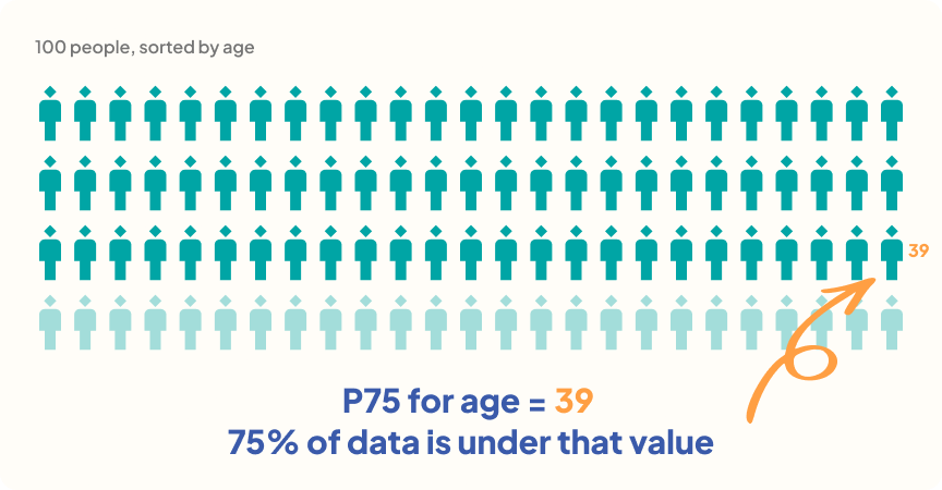
A percentile tells you what percentage of the data sits under a given number. If the 75th percentile (P75) for age in a room of 100 people is 39, that means 75 people in the room are 39 or younger (and we're probably talking about a tech startup!).
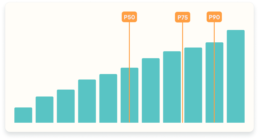
Some percentiles have special names:
Percentiles give you a clear picture of your data's shape, because you always know how many observations sit above or below a given point.
Both the mean and the median describe what's "typical" in a dataset – but they respond very differently to outliers. The mean and median are measures of central tendency. These are metrics that show you a common or middle value in the data – so they're used commonly in statistical analysis.
The mean (or "average") is calculated by averaging all the numbers together: sum all the numbers and divide by the count of numbers. Because the value of every number is included in the sum, the mean is susceptible to outliers. For example, if your largest number is 10x the next-highest value, that will drag the mean up.
The median doesn’t have that issue. It’s rank-ordering the numbers, so whether your largest number is 10x the next-highest or just 1.1x the next-highest, the rank doesn't change – and so the median likely won't be impacted. As long as you have 3+ numbers in your dataset*, one outlier won't change the median.
Another benefit of using the median is that you always know that 50% of the values sit above it and 50% of the values sit below it. This makes it much better for making real-world decisions.
For example, say you want your team's code changes to get a human review in under 4 hours. If you measured that goal with the average, one review that takes weeks would drag the average up, even if most reviews take under 4 hours. That single outlier would make the goal look further out of reach than it really is. Your P50 or P75, on the other hand, won't move if your dataset is big enough (in this case, at least 6 numbers.)
*On this: If you only have one or two numbers in your sample and one is very large, that will impact the median. When you have one value, the median is that value – and for a dataset of 2, you'll average the two values to get the median. That said, it's hard to draw any conclusions from datasets that are this small anyway.
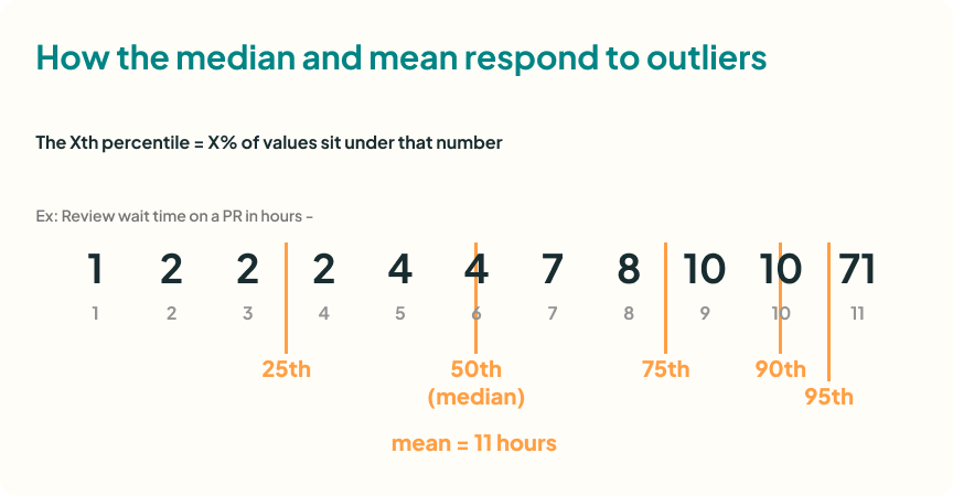
The image below shows these calculations in practice. If you have the review wait time (the time it takes to get a review on a piece of code) for 11 code changes (or pull requests, PRs), then you could have these values: 1, 2, 2, 2, 4, 4, 7, 8, 10, 10, 71
As you can see, there's one outlier – one code change had a review wait time that's 7x the other wait times. But neither the P50 nor the P75 are impacted – whether the top review wait time is 11 or 71, they'll both be 4 (for P5) and 9 (for P75).
The mean, however, changes. If the top value were 11, then the mean would be 5.5. But with a top value of 71, the mean is 11. That's a 2x difference, just from one number changing.
First sort the numbers in your dataset from smallest (with rank =1 ) to largest (rank = n, the number of observations).
There are several accepted formulas for calculating percentiles, but the core idea is the same: Cut the sorted data at the relevant point. For quartiles (=1/4), you split the data into 4 equal groups; for deciles (=1/10), into 10 equal groups. A percentile (=1/100) extends this to any of 100 different points.
I'll share two options for specific calculations:
So for P65, you’d pull in the score at or above 65% of the observations.
This one is straightforward since you're always using a number from your dataset – but it does mean that many percentiles collapse into the same value.
For a desired percentile k out of n observations and rank r:
r = k/100 * (n-1)+1
If r is not a whole number, then we look at the observations above and below r and use the fractional part of r to calculate percentile p:
p = r(below) + r(fraction) * [r(above) - r(below)]
💡Note that this sets the min value = P0 and max = P100. Other percentile formulas set min = P1 and max = P99.
You have data on how many cups of coffee your team members drank today. You’ve already ordered the 10 values ascending:
0, 0, 0, 0, 0, 1, 1, 2, 3, 4
I'll link to resources at the end for those who want to learn more.
This depends on your goals. For Multitudes metrics, we generally recommend P75. Here's why:
Note that previously at Multitudes, we started with a very stats-first approach and so used the median (P50) – because it's a central tendency metric that's resistant to outliers. However, we updated our guidance when we saw this in practice – because teams making decisions on their data don't want to know what happened with half of the work; they want to know what happened with most of it.
P75 walks a nice line between showing you what most (75%) of the work looked like, while still leaving room for outliers.
Something we're always exploring at Multitudes is the balance between the statistical fundamentals and what works best for helping teams take action on their data. That's why we sometimes update our guidance – and why we welcome your feedback on how we're doing with that balance!
Finally, if you liked this post, check out our prior "Practical Stats" post here: Don't measure AI impact by comparing AI vs no AI – here's why


Get useful insights on team performance and culture, along with updates on our product!
© Copyright 2026 Multitudes Limited. All rights reserved.

.svg)
.svg)
.svg)